Common Analyses
Typical questions of simulations and how they can be answered

When a simulation project is commissioned, our customers usually have similar questions:
How long does an evacuation take? Will there be waiting times or even congestions? If so, where and for how long? How will the available space be used?
These and other questions can be answered with various evaluation tools. The following section explains how this works and which tools are available to you for this purpose.
Tripwires can be inserted at various points in order to measure flow rates etc. The data of these tripwires can be summarized in tables and diagrams.
Thereby one learns:
- The total evacuation time
- The time at which the first agent leaves an area.
- The flow rate of the escape, i.e., how many agents crossed a line at a given time, whether the evacuation was continuous or staggered, etc.
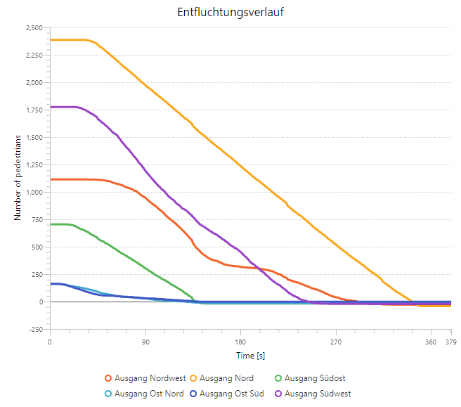
How can tripwires be evaluated?
The screenshot on the right shows that after about 3 minutes all agents have left the site. The graphs are linear, which implies a continuous outflow.
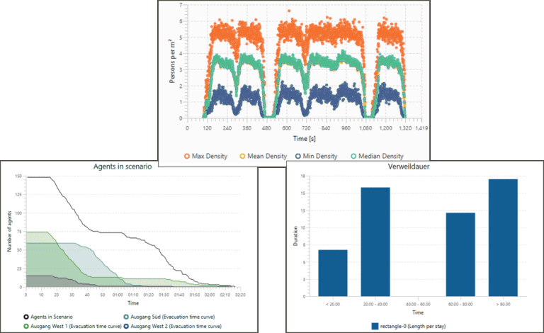
Analyze the behavior of the agents in a selected part of the scenario. For specific areas within your plan, a detailed analysis can be performed with polygons. You can evaluate the following measures and display them in diagrams:
- Waiting time, queuing time
- Density
- Speed
How can detailed analyses be evaluated?
The picture on the right shows the analysis of a bottleneck using a polygon. It shows how many agents pass the area of interest in a selected time period.
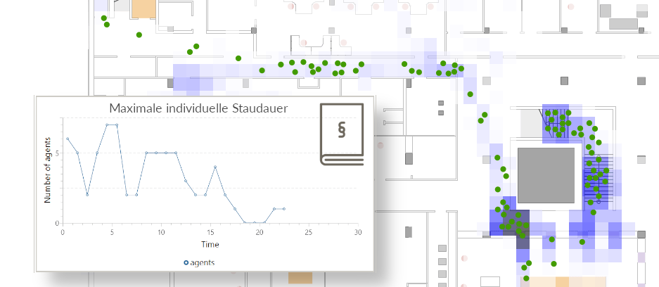
Heatmaps enrich spatial plans with information by color coding, which facilitates the analysis of simulation results.
To create heatmaps, the floor is divided into measurement tiles. This allows a variety of metrics to be calculated, such as:
- RSET: Each tile describes when agents last crossed it to determine the required evacuation time.
- Density: each tile describes how high the density is in that area to quickly identify bottlenecks.
- Speed: Each tile describes how fast agents move in the area (minimum, maximum, average) to evaluate flow rates.
How can heatmaps be evaluated?
The graph on the right shows an RSET heatmap. The darker the tiles, the later people leave that area during an evacuation.
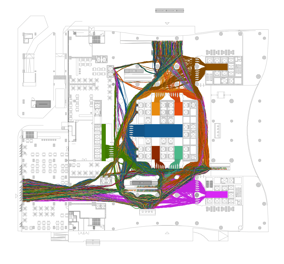
Agents can be colored according to their walking routes. Use them to identify busy routes and high-traffic areas.
Paths can be easily colored according to different criteria. Visualize the paths of all or individual agents, colored by origin, destination or ID. This allows you to quickly see where agents are coming from or going to.
How can paths be evaluated?
In the graphic on the right, the paths are colored according to the destination of the agents. You can see very clearly that there are areas in this building that remain unused. These passive areas can be used for other purposes.
You can modify all evaluations in crowd:it, freely select the data to be analyzed and display the results as diagrams, curves, screenshots or videos. The colors and the scales can be customized according to your wishes.
Moreover, you can export all the analyses and save your favorite reports to re-use them at any time.
Right you can see which info can be selected by "drag&drop" and displayed in a curve.